Centre name: Norbury Manor BEC
Centre Number:14343
Candidate Name: Nisha Rajan
Candidate Number: 0174
Unit:G324
Wednesday, 24 February 2016


Evaluation Question 4
Evaluation question 4: How did you use new media technologies in the construction and research, planning and evaluation stages?
Below is a SoundCloud clip explaining the use of new media technologies in the construction and research, planning and evaluation stages.
Summary:
I found that using media technologies were very important especially during the construction and research stages of my trailer. In order to film the trailer, we used a DSLR camera, a tripod and handi-cam. We came across the problem of lack of lighting so we used flashlights from our phones and lamps we found in the surrounding setting. Moreover, in the construction process, we used Adobe Premiere to edit and remaster our trailer. In terms of research, we used web 2.0 and YouTube to adhere to conventions found in existing media texts and to also research effective subversions we could apply.
With regard to the planning and evaluation stages of the trailer, I used Blogger to understand how much more work was needed to be done and how to improve aspects of both the main media product and the ancillary texts. Soundcloud enabled me to make quick clips with people in my target audience group to receive fast and effective feedback which was crucial for developmental stages of construction.
The main piece of media technology used for my poster and magazine cover was Adobe PhotoShop. Adobe PhotoShop enabled me and my group to create a professional end media text piece and I was able to adhere to more skills during this process. I also used dafont.com to find professional font styles for the masthead/ title for the poster and magazine cover, this website was very effective as it provided an abundance of font styles to choose from. In terms of both construction and planning, I used YouTube to look at how to use Adobe PhotoShop and understand some features I had not used before. I had also used Blogger to witness my progress and understand what skills and elements of constructions needed to be improved and completed. During research and evaluation stages of the poster and magazine cover, I had used web 2.0 to understand the effective elements of existing posters and magazine covers to apply this to our own in order to increase levels of professionalism, For evaluation stages on my blog, I used media technologies such as Prezi, Soundcloud and QuickTime to present my findings effectively and clearly.

Evaluation Question 3
Evaluation Question 3: What have you learnt from your audience feedback?
The video below shows a clip of audience responses from the day of our premiere.
Evaluation Question 2
Evaluation Question 2: How effective is the combination of your main product and ancillary texts?


Evaluation Question 1
Evaluation question 1: In what ways does your media product use, develop or challenge forms and conventions of real media products in relation to both my main product and ancillary texts?
This is my first Evaluation question which answers the question of; In what ways does your media product use, develop or challenge forms and conventions of real media products in relation to both my main product and ancillary texts.
Tickets for Premiere

This is the final ticket we had created on Photoshop for our premiere and below is the ticket in Photoshop during the construction process.

Front Cover Target Audience Feedback
This focus group shows audience feedback from my magazine cover.
Tuesday, 23 February 2016
Individual Contribution
Summary:
In terms of individual contribution in regards to the trailer, I was more involved with the filming process opposed to the editing process. When filming shots for our trailer, I made significant suggestions, most of which were included in the final trailer product.This would include the scenes where the Bible appears to be flickering by itself (to reinforce biblical references within the trailer), the chanting scenes of Bible verses and peep hole scene where the villain appears at the door. In terms of filming, I suggested filming the road-side scene where the main character is visible in the middle of the road and a whip-pan leads audiences to see the villain positioned behind her.This was an effective jump scare scene which is conventional within horror trailers.
In terms of editing, I created the ending credits sequence which features all the cast and crew members. I used a professional image of credits to increase levels of professionalism to our trailer. In terms of sound within the trailer, I was looking for an effective sound transition to mark the end of the equilibrium and start of disequilibrium; to do this I typed keywords such as "demonic screaming" into YouTube and also looked at successful existing trailers to gain background research into what sounds scary and effective.
When constructing the magazine cover, I had a significantly important role as I edited this media text piece. I made a list of fonts to choose from to gain a wide idea of what theme I was going for. Moreover, when making significant changes to the text piece, I actively consulted members of my team to gain a second opinion on decisions I had made. With regard to the construction of the poster, I had made a plan which consisted of layers of both text and images in photoshop. This in turn made the process easier for my team member who then created the final piece as she knew the layout and then added in elements like the photo, masthead and credits.
Below is a Soundcloud outlining my individual contribution the both the main media text and ancillary text.
Monday, 22 February 2016
Poster Features

Below is a Soundcloud clip featuring the reasons for why I had included the poster features I did and for what reason.
Summary:
Point one highlights a small review placed at the very top of the poster. This is done to enable viewers to understand how established critics feel about the film and whether the movie itself is worthy of watching.
Point two shows the tagline which is in-keeping with the Christmas theme of the film with a sinister twist which is fitting for the horror genre. This is coloured the same hue of red that is the villain face, I thought this fit well with the poster and tied all elements of colour together.
Point 3 highlights an image which has been placed in a circular format to resemble that of a peep-hole that features on doors.The sides of the image fades out into black which is the same colour of the rest of the poster. the peep hole element was an idea I had thought of as it links with our trailer very well.
Point 4 shows the cast and general production list of those involved in the making and editing of the trailer. This was done with aid from an existing poster in order to retain professionalism. The very bottom of the poster include logos from universal studios- this was done to further the element of professionalism. Next to this features the date of the film release into cinemas which is coloured in red to draw attention to it as the rest of the poster is significantly dimly lit. On the far right side features our logo "House of Shadows Productions".
Point 5 circles the BBFC age certification of the film, this is a convention followed by all major film posters; this signals to the viewer the levels of horror, violence, sexual references and strong language.
Clear Links of Poster to Trailer and Magazine Cover


The above screen-shots are in chronological order and highlight the importance of the door and concept of intrusion which is relevant in all three media texts. In particular, the trailer uses the door as a means to establish both the welcoming of equilibrium and the disequilibrium shots.

Above is an image of our magazine outlining the features which are similarly represented on our trailer. I have included a Soundcloud track which goes into detail about the features which are similar on the magazine and trailer.
Research into Empire House Style
The prezi above shows the main conventions present in Empire House.
Magazine Shot List and Mise-en-Scene
Magazine Images: Shots Taken and Mise-en-Scene by Slidely Photo Gallery
The above Slidely shows the final shot list for images taken for our magazine cover.
http://slide.ly/gallery/view/e51e1092c48526f02f2560bacdd35330?utm_content=embed_overlay
Font and Image Decisions
When choosing appropriate fonts for our poster, we decided to use dafont.com as it provided us with comprehensive list of professional fonts to choose from.


Above is the document featuring all of the fonts I chose which my group later made a definitive decision on in regards the the final appearance of the title "The Gathering". When on dafont.com,I was specifically looking for fonts which mirrored our theme of horror and the general Gothic genre. However, I was sure to look for fonts which were not thin and hard to work with on Photoshop as this would be time consuming and not as effective as a bold and thick font. We decided to work with the font on the second font on the second page of this document as it looked the most professional,was adequately spread out and most in-keeping with our theme.
Sunday, 21 February 2016
Poster Target Audience Feedback
Here are some comments and thoughts for improvements made from two members of my target audience group.
Image Manipulation
Here is some evidence of image manipulation achieved on Photoshop.


Here are the before and after shots taken without and with "Smart Filters" and adjustments made to light levels, brightness and contrast. The overall end results leave the final product to be a lot more in keeping with the horror genre.
We also saved two copies of the image we have chosen in order to compare changes during the production process. This was also done to keep a spare layer of the image just in case we had made mistakes to the original.


We also saved two copies of the image we have chosen in order to compare changes during the production process. This was also done to keep a spare layer of the image just in case we had made mistakes to the original.

Here is an image of both the pictures, highlighting changes before and after.

Photoshop: Poster Layout

This is the layout of our poster. We had used over 40 layer to achieve this product alongside image manipulation and editing of text.

When decided on the general layout for our poster, we looked at the above posters as inspiration and we liked the centered title text of the first poster and the closeness of the image on the second picture. We though it would be very fitting to keep the image of the villain to be seen through a fish-eye lens as it is in-keeping with the theme of intrusion.
Poster Photos Taken and Mise-en-Scene
Poster Images by Slidely Photo Gallery
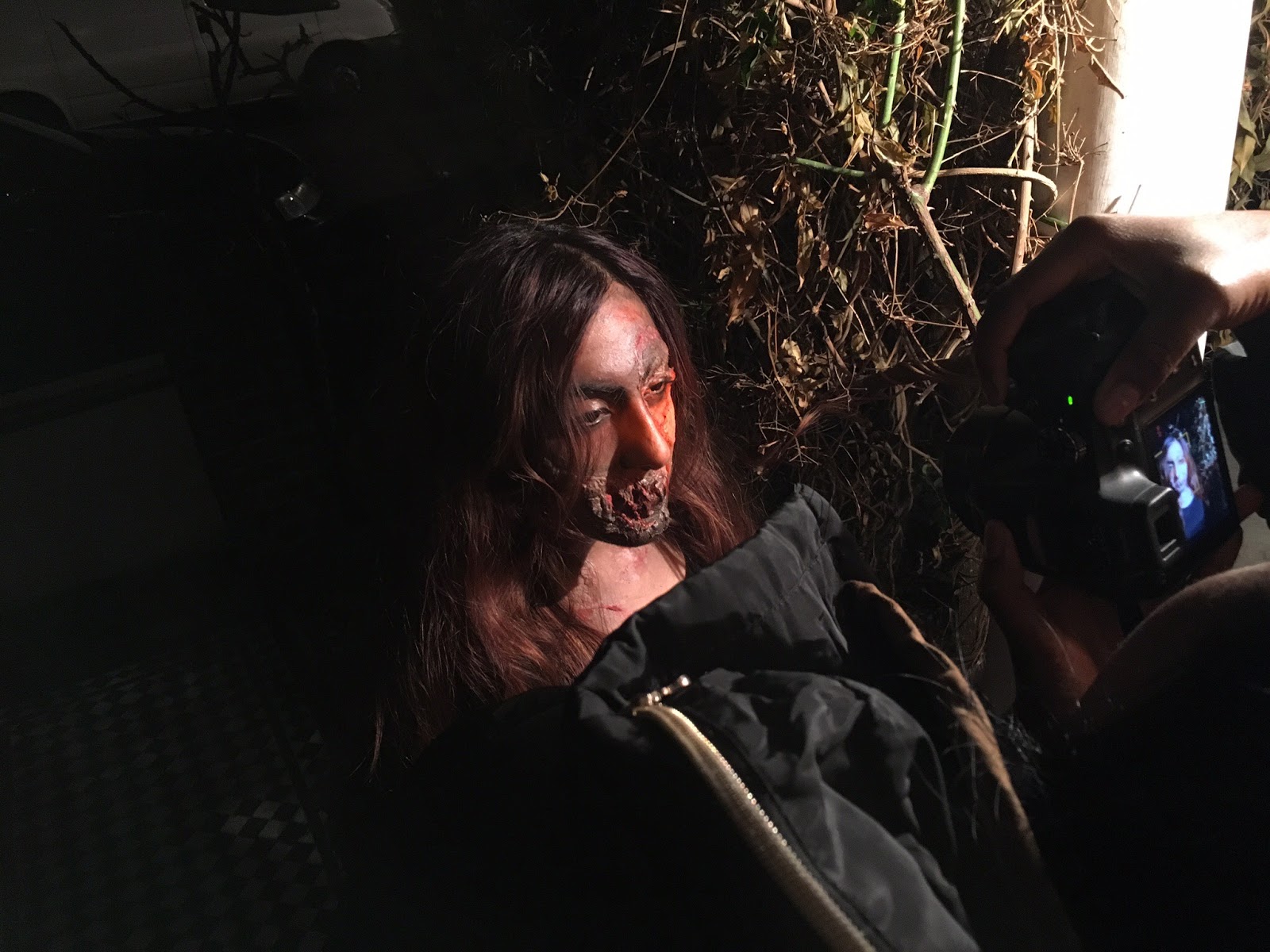
Above is a slidely gallery with all of the images taken for our poster. We decided to use shots which were outside of the doorway to reinforce the idea of intrusion into the home environment which is typically seen as safe. In terms of mise-en-scene we used Christmas lights as the trailer was based in the setting of Christmas time, we also subverted the use of this from being associated with joy and festicites to being linked with murder and death - as shown above, it is wrapped around one of the main character's ("Tiffany's") neck. Moreover, we nscar make-up on the victim for a more realistic look of being possessed and generally hurt. This was similarly done to our villain with use of liquid latex, face paint and tissue paper to create the "grill-like" mouth effect.
Construction Linked to Theory and Storyboard
The images below show how our story board links with our trailer.


Summary:
When deciding on the basic story-line for our trailer we decided that it was fitting to create something which focused on the concept of moral panics- particularly the current topic of social media becoming increasingly intrusive. We decided to use four girls as the main characters, with a main character with a unisex name "Alex". We thought this was particularly fitting as it was also used as part of the "Final girl" theory by Carol J Clover.We also decided to use a female villain character "Her" to include the "Monstrous Feminine" theory element which was created by B.Creed. Many of the shots used throughout the trailer were those which appeared quite intrusive and mirror that of a "Male Gaze" as mentioned in Laura Mulvey's theory. This was done to make audiences feel almost uncomfortable with their personal viewing position and insight into the lives of young girls in the home environment.
In our storyboard, we included elements featured in the film "Scream", this included the use of the telephone ringing and marking the start of disequilibrium in the trailer. Moreover we used elements from the film "Drag me to hell" which features the main characters sitting and chanting around a table during a stage of repairing the disequilibrium. The use of these factors highlight our use of "Todorov's Narrative Theory" and how it complies with our trailer.
Tuesday, 26 January 2016
Construction Linked to Theories and Storyboard


Above we can see some shots taken and how they link to the storyboard that we had created during initial stages of production. During the filming process we decided to alter some shots and scenes as well as incorporate more features of mise-en-scene that were based around Christmas as we found that it was effective for our horror genre to incorporate subversions such as a jolly Christmas theme. During this process we also looked into more conventional horror trailers in order to understand what kind of scenes and shots were most effective and professional looking.


Rough Cut
This video presents our rough cut which was created at initial stages of production, The rough cut does follow our story-line yet it was within the process of creation that we discovered that elements of our story-line didn't make sense or didn't follow through with conventions of a horror film. Making the rough cut enabled us to find out which scenes we were missing so that we could plan other days to film. This rough cut is still missing some integral scenes to the plot however, we were soon able to fill these gaps with two extra nights of filming.
Friday, 22 January 2016
Shots Taken and Mise-En-Scene
The images taken for poster by Slidely Photo Gallery
These images show the test shots for our poster, the majority of these shots were taken outside with the light from the front garden and flashlight apps from our phones. We used high angles to simulate the "peep-hole" effect which places emphasis on the element of intrusion and voyeurism.
Research into Use of Music
When deciding what kind of music to include in our trailer we looked at a multitude of trailers with similar concepts. We found that the majority begun with happy and upbeat soundtracks that then progressed into slower tracks, got cut off completely or got distorted. An example of this would be the "The Visit" trailer which was a film that came out last year in September.
This is also achieved in the trailer for "Unfriended" which was released in January. The music progresses from light and happy to suddenly being cut off by non-diegetic sounds which is a feature that has been used in out trailer.
When deciding on the types of sound effects we wanted to use, we looked into existing media texts to find out what worked best naturally without appearing out of place. Below are two clips of sound effects that we have used in our trailer.
Use of Sound Effects
The sound clip below highlights some of the sound effects we used throughout out trailer. We found that the majority of the sounds we included, appeared to elevate and get higher in pitch to come across as scarier and to build up tension; this was included after the period of the disruption of equilibrium. After putting in sound effects with music included, we started putting in diegetic sounds such as heavy breathing and panting as well as door knocks and phones ringing. We did this as after the production process, we found that most of the sound made during recording was made fainter by music and other sound effects put in during post production. The diegetic sound effects put in and heightened allow the audiences to really understand how the characters are feeling and this is especially important with the genre of horror.
Posts on titles and font use

From these fonts chosen from www.dafont.com, we have narrowed it down to the font circled below. As a group we came to this conclusion as the font was at an adequate thickness for manipulation on Photoshop but also narrow and professional enough to keep the theme of our magazine (horror) intact.

Evidence of controlled use of camera


In order to create the right ambiance for this shot, we decided to use light from a phone. This was to include a white light which appears to create themes of exposure and panic as the normal yellow toned light conveys a feeling of calmness and normality, The camera in this shot was positioned at the top of the stairs whereas the actors where at the bottom running towards the camera and in this case safety. As they both frantically run to safety, one actor is pulled down the stairs and away from the camera by the supernatural force which illustrates the idea of further transgression from the equilibrium,


Here we have a camera placed on one of my team members. It is placed in such as way to effectively create panning shots smoothly ans steadily as we did not have access to a track to create a dolly shot. Moreover, the dolly was placed at a lower angle than eye-height to convey the idea that it was through the eyes of the villain who would be lurking around the house. This is similar to the shot taken below.

In order to create a similar idea of dominance with the villain, the majority of the shots after the distribution of equilibrium were at a lower angle as the villain now has full power over the protagonists.


These shots above were shot by hand without the use of any equipment to create the effect of intimate scenes were the audience may feel closely attached and included with the goings on in the situation. The natural jolts and movements created by the hand of the camera places emphasis of the feelings and general build up of tension and suspense.
Exploring Shot types and Sizes

In terms of shot types and sizes we used both the steady-cam and tripod as resources to film our shots. We also took the camera off of these pieces of equipment to create a handheld effect for shots which elevated elements of horror and suspense as we as the viewer were put in the position of the victim.


When presenting our villain character we used both high and low shots to allow the viewer to take in the entirety of the visual effects that we had presented. The higher shots mimicked what the villain would look like through the fish eye lens or "peep hole". The "peep hole" feature plays an integral part in all aspects of our media texts as it conveys the feature of voyeurism and intrusion. Moreover, the lower angled shots highlight the superiority present in the villain character in comparison to the protagonists and final girl.

This is an example of a close up used for our trailer; in the rest of the trailer we used over the shoulder shots to enhance the feelings of intrusion and demonic possession through the use of a repeated circular panning movement. This was accompanied with repetitive chanting from the Bible.

Another example of an intrusive close up shot.

Low and wide angle shot to highlight a protagonist entering the home from the outside which is dark and seemingly unsafe into the supposed safety of a home which is brightly lit as a contrast.


This is an extreme close-up with a darkly lit background which put focus onto the distressed and badly injured protagonist. She is holding a lighter which is the only source of light in the scene which is quickly removed when she is dragged across and away from the floor.

We used a slow pan to the right in this shot to emphasise themes of joy within the house and all the the characters.
Subscribe to:
Posts (Atom)